Chrisp Street Lighting Strategy, London
Chrisp Street Category Space Date ongoing Location London Architecture Sheppard Robson Architects Urban Regeneration The commercial...
Category Space
Date ongoing
Location London
Architecture Sheppard Robson Architects
Urban Regeneration
The commercial market of Chrisp Street is where tomorrow’s Chrisp Street area can be created and experienced; a platform gathering together a lively collection of activities.
It explores different opportunities of how lighting can be used in combination with the neighbourhood branding to create a destination and boost Chrisp Street Market District’s night-time economy with an exciting, unique experience for residents and visitors.
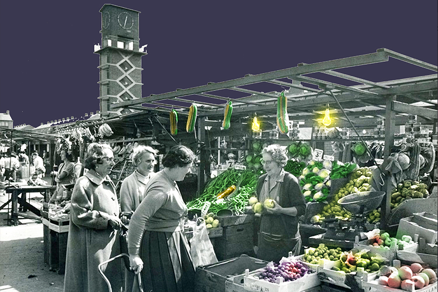
The centre was originally designed by Frederick Gibberd as part of the ‘living architecture’ element of the 1951 Festival of Britain and was the first pedestrianised shopping centre of its kind. This post- Second World War redevelopment provided a central square that became not only the first pedestrian shopping centre in Britain, but also a landmark in new urban design. The whole area still retains many of the original architectural features, such as the iconic Clock Tower and the traditional 1950’s-style housing lining Market Way.
Today the market sells anything and everything from plants and fruit to clothes, bed linen and children’s toys. Whatever the weather, the friendly cafes in the square offer traditional fare, including the East End’s own great Chinese and Indian food. So come and sample what’s on offer while soaking up the atmosphere of this unique centre.
Chrisp Street has so much to offer and a great deal to be proud of: a vibrant, diverse market and retail centre with a strong sense of identity and heritage.
The centre is located in the heart of Tower Hamlets with a catchment area that has an enormous potential customer base.
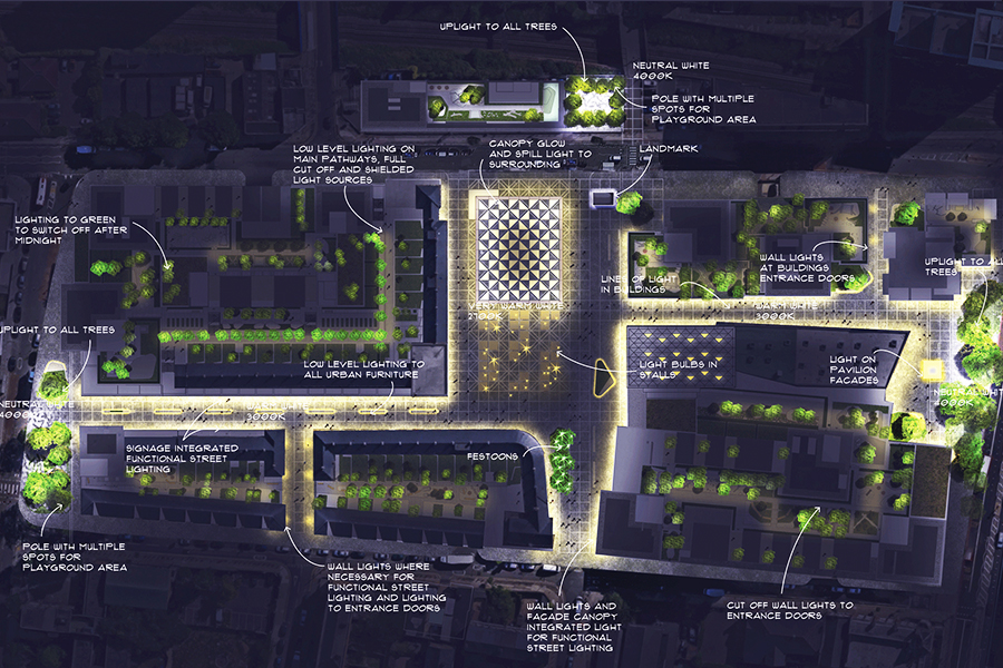
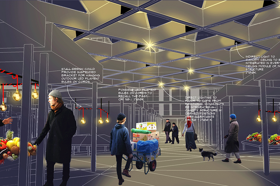
The canopied market and the stalls are the visual and economical heart of CSM.
Arriving from Vesey Path and Market Way, the canopy is the focal point of the square, particularly during dark hours.
In order to welcome shoppers, enhance the canopy’s construction material, and to create this sense of soul and heart of the development, a very warm light and very high colour rendering, are used.
The system is a re-interpretetaion of the existing system, giving retailers the maximum flexibility, but keeping under control the overall image, colour of light and colour
rendering.
In a space where legibility is totally missing, historical and new landmarks and buildings are important to create a sense of unique identity.
The Clock Tower is re-lit: neutral white light for the interior and the clock is enhanced by on the four sides of the tower making it visible from both DLR stations.
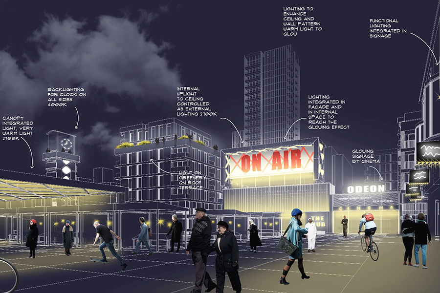
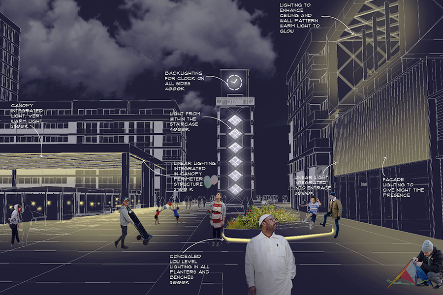
The tower is lit internally (no uplight on the exterior is allowed) to match the elements of glowing light on the new glass building facing the square and the canopy.
